Analysis of average men's T-shirt prices for 2022–2026 using Singular Spectrum Analysis (SSA)
While studying time series analysis, I came across a remarkable method — Singular Spectrum Analysis. I decided to try it out by breaking down the prices of men's T-shirts. In this article I'll walk through how I decomposed a series of weekly prices into its components: trend, periodic fluctuations, and noise. Along the way I adjusted the price for inflation, in order to find out whether the item is actually getting more expensive or is only rising nominally, together with inflation. I took the data from Rosstat for the period from January 10, 2022 to August 24, 2026.
Sources of price and inflation data
I took the data from the Rosstat website, in the "Prices, Inflation" section. I used two documents:
- "Weekly average consumer prices for selected goods and services" — this is where I took the T-shirt price itself, in rubles.
- "Weekly consumer price indices for selected goods and services" — this is where I took the inflation figures for the same item.
The item I chose was "Undershirt, men's underwear T-shirt, per unit." The analysis period is from January 10, 2022 to August 24, 2026.
The distinction here matters: the price is how much the T-shirt cost in rubles on each date, whereas the consumer price index (CPI) is the percentage change relative to the previous date. For example, a value of 100.39 means that prices rose by 0.39% over the week.
CPI (Consumer Price Index) — an indicator that reflects the change in the cost of a fixed basket of goods and services over time. It is the official measure of inflation.
To remove inflation, I converted the weekly CPI increments from percentages into fractions and multiplied them cumulatively — this gave a running inflation index from the start of the period. Then I divided the nominal price by this index. The result is the real price in first-week-of-2022 prices, cleared of the general rise in prices across the economy.
Data preparation: filling in the gaps
Rosstat usually took its measurements on Mondays. But some Mondays fell on public holidays, and no measurement was taken — for instance, the first Monday of January is missing every year. And in 2022 measurements were more often taken on Fridays, with Rosstat only switching to Mondays later.
By definition, a time series is a set of measurements taken at equal time intervals. To obtain a proper time series with equal intervals, I did two things. I shifted the measurements taken on Fridays in 2022 and during holiday weeks onto Mondays. And I filled in the missing weeks: I added the absent Mondays and used the previous measurement as the value.
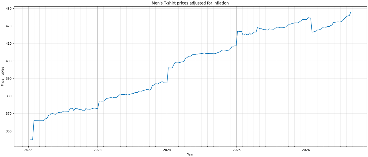 Chart of the original real-price time series.
The idea behind SSA
Singular Spectrum Analysis (SSA) is a method that decomposes a time series into separate independent components: trend, periodic fluctuations, and random noise. Its main advantage is that it requires no assumptions about the nature of the series and has just a single tunable parameter — the window length.
The idea of the method is to turn the series into a matrix and apply the tools of linear algebra, which are good at finding hidden structure in matrices. The method consists of four stages.
1. Build the trajectory matrix. The series is "sliced" with a sliding window of length L into overlapping pieces, and these pieces are placed as columns of a matrix. This turns a one-dimensional series into a two-dimensional matrix.
2. Decompose the matrix using Singular Value Decomposition (SVD).
SVD (Singular Value Decomposition) — a way to factor any matrix into a product of three matrices: two rotations and a stretching between them. The stretching is defined by a set of numbers — the singular values — which show how strongly the data is stretched along each independent direction.
This decomposition can be rewritten as a sum of elementary matrices, each with its own weight. And this is not some new decomposition, but the same matrix written differently: the product expands into a sum of terms, much as (a + b)·c = a·c + b·c. The terms are automatically sorted by importance: the first ones reflect strong patterns (trend, powerful cycles), the last ones — noise.
3. Grouping the elementary matrices. There are many elementary matrices, and individually they are of no use. They need to be combined into groups: which belong to the trend, which to one cycle, which to another, and which to noise. The appearance of the matrices and the correlation matrix help with this: matrices strongly related to one another describe the same pattern and are combined into a group.
4. Reconstruction. Each group of matrices is transformed back into a time series. In the end, the original series is decomposed into meaningful terms — trend, periodicities, and noise — which sum up to the original time series.
The trajectory matrix
The first step is building the trajectory matrix. I move along the time series with a window of length L, shifting the window by one position each time, and place the resulting vectors into columns. These columns form the matrix.
The window length L must be no more than half the length of the series. At the same time, SSA extracts periodicity better when several full periods fit inside the window. I assume the series has an annual periodicity — that is 52 weeks. So I chose L = 102: this is two annual periods and at the same time less than half the series, which contains 242 measurements.
In the resulting trajectory matrix, the anti-diagonals hold identical values — this is its characteristic property.
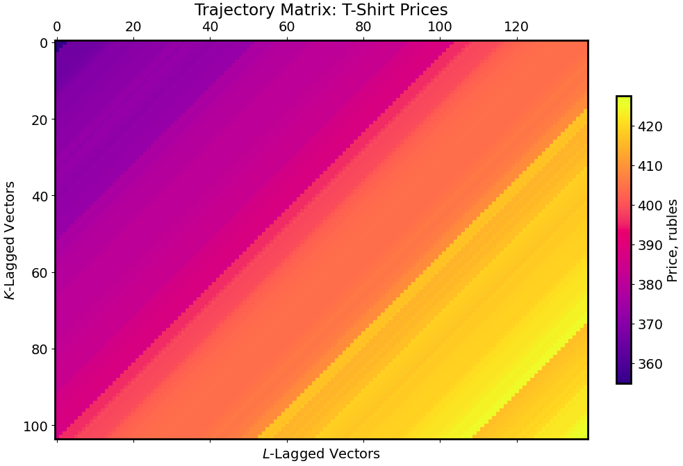
Visualization of the trajectory matrix.
Decomposing the matrix into a sum of elementary matrices
Next I decompose the trajectory matrix using Singular Value Decomposition (SVD) into a sum of elementary matrices. Each such matrix is responsible for its own pattern in the series, and they are all sorted by importance — from strong structures to faint noise.
The elementary matrices can be visualized: color highlights regions of similar values. From these patterns you can already guess the nature of a component by eye. A smooth color gradient indicates a trend, a "checkerboard" pattern indicates periodicity, and fine chaotic movement indicates noise. The size of the "checkerboard cells" hints at the period of the fluctuation: identical cells mean identical periodicity.
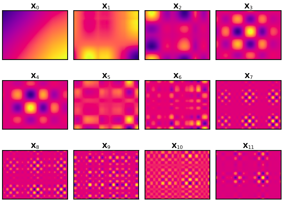
Visualization of the first elementary matrices.
Grouping the elementary matrices
To work out which components to combine, I built a correlation matrix. Only the first few components carry information about trend and seasonality; the rest is noise. So it makes sense to take a closer look at the correlation of the first fifteen components.
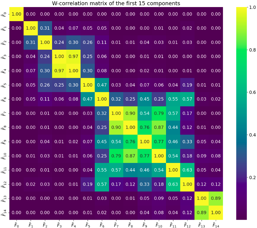
W-correlation matrix of the first 15 components.
Based on the correlation matrix, I grouped the components as follows:
- Component zero does not correlate with the others — I leave it on its own; this is the trend.
- Components one and two are weakly related to the rest — I also leave them separate.
- Components three and four are strongly correlated with each other (0.97) — I combine them into one group.
- From component five onward the correlations are diffuse: each is related to many neighbors at once (0.47–0.90), with no clear isolated pairs. This is a sign of noise, so I assign components five and onward to noise.
The same similarity can also be seen in the visualization of the elementary matrices: the sizes of the "checkerboard cells" for components 3 and 4 are roughly the same, which indicates similar periodicity. At the same time, their cells differ from those of components 0, 1, and 2. Components 1 and 2 have cells of a different size, and component zero has no cells at all — this is the trend.
Reconstructing the series: trend, periodicity, noise
Now I reconstruct the time series from the elementary matrices by groups: components F₀, F₁, F₂ separately, F₃–F₄ as a combined pair, and everything else as noise. Together these groups make up the original series.
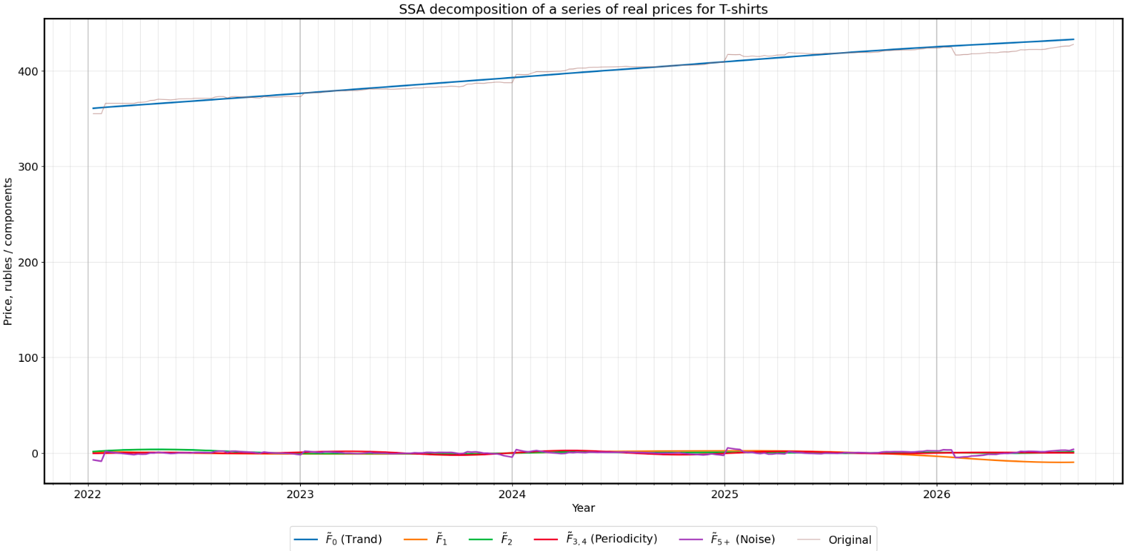
Chart of the series decomposed into trend, components, and noise.
Conclusions: how men's T-shirt prices changed
The average real price of men's T-shirts has a rising linear trend — this is shown by the trend component F₀.
Besides the trend, the price has several other components:
- a slow periodic component F₁;
- a periodic component with a period of about 10–11 months (F₂);
- a periodic component with a period of about 12 months (F₃–F₄), that is, annual seasonality.
The contribution of all these components to the price is small — up to 3%. They fluctuate within ±10 rubles at a price of about 400 rubles, so they make little difference, and the main dynamics are driven by the trend.
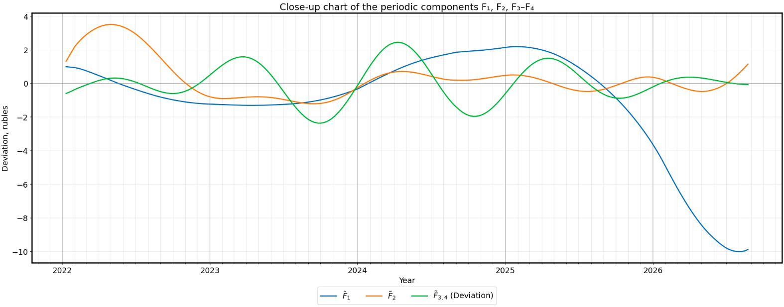
Close-up chart of the periodic components F₁, F₂, F₃–F₄.
❗️ Conclusion: based on Rosstat data, the average price of men's T-shirts rose almost linearly and increased by 20% over the period from January 10, 2022 to August 24, 2026. This is real growth, cleared of inflation.
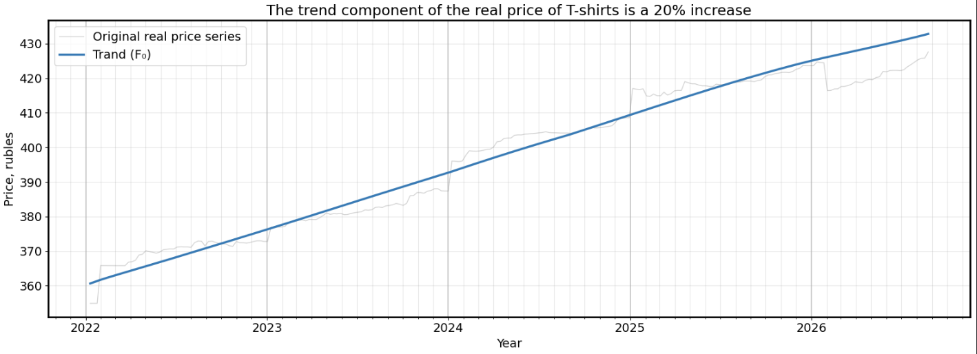
Chart of the trend component F₀.
👉 Link to the Python notebook with the code.
👉 Link to the data sources: Rosstat, "Prices, Inflation" section.